These are the 2018 Color Trends That Should Be On Your Radar
The predictions for next year are in.
By
SARA TARDIFF (Article appears on
ElleDecor.com)
We are officially halfway through 2017. Not totally sure how that happened, but we're here, and we're already pretty eager to see what 2018 has in store.
Of all the design trends we look forward to most in the coming year, color holds a steady spot at the top of our list. After all, it sets the tone for what furniture we buy, what decor we invest in, and the overall mood for that design year.
Sherwin-Williams predicts that 2018 will embody the spirit of contemporary life with their three color palettes: Affinity, Connectivity, and Sincerity. Each one is inspired by the collective culture of the moment — from fashion to technology — and captures the aura of a year that is bound to be full of progress.
Read on for the inspiration behind the brand's 36 color predictions for the year ahead, and maybe even get a jumpstart!

Sherwin-Williams
Affinity
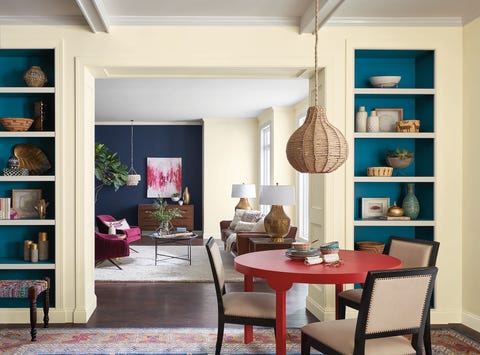
This color story of striking blue, animated fuchsia, and stabilizing brown, the Affinity palette is set to celebrate the connection of people and places.
“We’re remapping our sense of community, landlocked cities are becoming global hubs of crafts and gastronomy,” says Wadden, Sherwin-Williams' Director of Marketing. “Home and car sharing, as well as e-learning, have created a culture of everyday nomadism and the wanderlust-obsessed.”
Affinity is just like any good getaway: relaxed but full of unexpected fun. Decorateaccordingly with a base of neutral browns and vibrant accent colors in an array of pinks and blues.

Sherwin-Williams
Connectivity
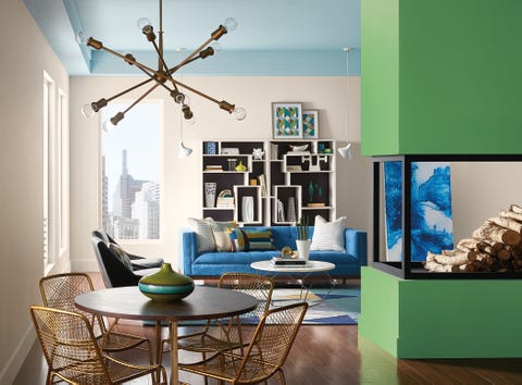
The Connectivity palette draws from innovations in tech, including pixelated oranges, digital blues and greens, and high-def yellow.
“In Silicon Valley, Austin, Berlin and Beijing, techies are the new hippies, full of breakthrough ideas and utopian ideals,” Wadden says. “Connectivity is modern and playful, bringing in dark watery tones of blue that are balanced with neutrals, warm yellow and energetic purples.”
Punctuate any room with some tech-inspired hues (like this bright green fireplace), while working in some much-needed warmth with understated grays and creams.

Sherwin-Williams
Sincerity
Minimalism isn't going anywhere in 2018. However, it is taking on a less structured look.
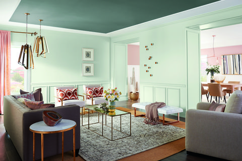
“With the Sincerity palette, silence is no longer empty, but instead is rare and rich with possibility,” says Wadden. “Sincerity is about mindful living and creating an environmentto disconnect and recharge. Soft, washed neutrals, greens and sanctuary pinks work together to create harmony.”
Step away from the stark light and dark contrasts and embrace color fluidity. This palette is all about ditching harsh lines for sandy browns, muted grays, and hazy greens that harmonize perfectly. Don't stress too much about sticking to a strict color scheme, but instead let one organic shade blend into the next.